Showing posts with label design. Show all posts

November 06, 2018

Building the Fabrik Wall

By Ned Potter, Academic Liaison Librarian 

At the start of the academic year we reached a significant milestone in our use of UX at York (about which you can read many, many more posts elsewhere on this blog). We made our first major purchase as part of a re-design that came directly from an ethnographic project - woohoo!

We bought a sound-absorbent wall made of 'Fabriks' - it works like giant Lego, looks pretty cool, and controls the acoustics of the environment around it.

Here's what it looks like:

The Fabrik Wall as seen from the front

The Fabrik Wall as viewed from 'inside' it
To get the context to all of this we need to go back to 2017.

The UX Space Project

During 2017 we undertook the UX Space Project: ethnographic User Experience research into how the Morrell Lounge is used and how it might be improved. This is the area you see as you enter the Library at York - on average around 3,000 people pass through this every single day, making it perhaps the busiest area on either campus. At peak times there's around 7,000 entries.

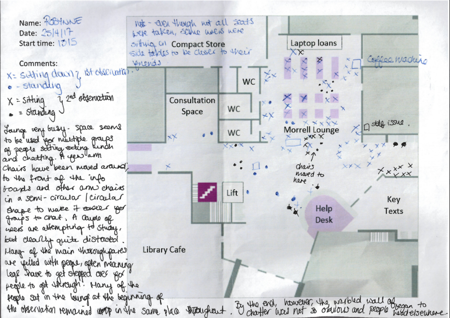
The fieldwork consisted of more than 40 sessions of behavioural mapping. We actually had to modify the 'standard' way we'd done observation like this before, because the area was simply too busy to track people's routes through the space. That element was removed from the list of responsibilities, but we made other tweaks too: for the first time we used a template map of the space (based on our floorplans), we put a definition of the AEIOU framework on the back along with other guidance to remind people what they were looking for, and left space for notes on the map itself.

Here's an example of the map and notes from one observation session:


A behavioural map with notes 
The fieldwork was undertaken by Customer Services staff (each of whom had individual training before their first session) and they were absolutely brilliant at capturing key info, and then feeding into the design process to find solutions too. All CS stuff kept notes of their thoughts on the space when working at the desk too, so we built up a picture of how the area was used even on days when we didn't have a Behavioural Mapping session planned. This turned into a massive 19-page Google Doc, which also included feedback from students and staff as it came in.

The initial phase of fieldwork lasted 6 months. The project identified problems including the area being too loud for those wishing to seek guidance at the Help Desk, it being unsightly to visitors as students are sprawled on the floor, and fundamentally the space not being used as we intended.


Design Prototyping

We ruled out trying to change the way the space was used, early on in the process. Instead we wanted to change the space to better suit the way it has been adopted by students and staff: this included swapping furniture with other areas of the Library to suit the way people congregate in groups, which was our first proper attempt at design prototyping. The changes we made went down so well, getting so much positive feedback (we had people emailing the library just to tell us how much they liked it!), that following another round of observational fieldwork we ended up leaving the temporary furniture in situ. It's still there now, although long term we'd like to improve the space further - we have a full design ready to go, based on all the research and suggested changes we've come up with, but it will cost a lot of money to realise.

Most costly of all we really wanted some kind of acoustic baffling to both contain the sound and make the entrance lobby a visually arresting sight with which to greet our regular users and visitors. We went through several rounds of a bidding process to try and win some Alumni funding to make big changes to the space - in the end the 'YuFund' scheme provided us with the funds to purchase what we're calling the Alumni Wall that you saw at the start of this post, made of special sound-absorbent ‘fabriks’ to change the acoustics of the space. And the acoustic difference is absolutely remarkable, significantly reducing the noise spilling from the Lounge, and in particular better enabling staff and students to converse at the Help Desk. Many staff have commented on the effect this has had - it is now noticeably easier to help people with queries - and the students like it too: ’Wow I really like it!’ one returning student exclaimed, coming to the desk especially to tell us… It also looks fantastic, and gives the whole area a more cohesive feel.

The whole project felt really exciting to be part of. It involved people from different teams in the Library working together, which is always good, and the Alumni Office (and the Students' Union) were really enthusiastic about what we were doing. Ultimately we were able to make a significant change to the space, and overall it works much better for both students and staff than it ever has before.

Finally, here's a short time-lapse video of its assembly:


July 06, 2017

UXLibsIII: reflections from a regular

By Martin Philip, Academic Liaison Librarian

I just keep coming back for more!

There have been three UXLibs conferences so far (clue is in the name!) and I’ve been to all of them. For me, there’s no other event, let alone conference, that I’ve been to where I meet so many interesting people from so many different countries. It’s brilliant! And in one sense, as fantastic as the keynotes, delegate presentations, workshops, team challenge are, the international feel to this event brings it to life. It adds something extra. When I think of UXLibs, in addition to UX, I always think of the people I’ve met and the UX stories I’ve heard from all over the world.

The conference this year was in Glasgow, yet again utilising the creative space(s) provided by the studio. (If you need somewhere for an afternoon, a day or two, then try these guys!) The space and structure of the conference was great! Much like the previous two years, the regular coffee intervals and plenty of break-out areas all add to the conference dynamic, creating a relaxed, informal setup which allows you to move about the whole space quite freely.

UX is about living with uncertainty and being ok with that

In opening the conference, Andy Priestner gave a bit of context and set the scene for the event which I think was helpful both for those of us that have been to UXLibs before and any first-timers, of which there were many!  

The first UXLibs in 2015, was, for many, the first time we’d looked in detail at UX principles and techniques or certainly in the context of libraries. At UXLibs II last year, we looked at advocacy of UX in our institutional context, how can we get those in senior management, colleagues and students on board. This year Andy got us to consider UX maturity in libraries and reflect where we are on that journey by introducing his new model of UX Adoption in Libraries. This model looks at the success or not of UX adoption at your institution. After a few years of using UX techniques in quite a few projects at York, I’d definitely say we’re moving in the SUCCESSFUL direction. More and more of our internal groups and projects are keen to use UX techniques in the Library after being made aware of the quality data we’ve been getting and positive changes we’ve been making on the back of it. The challenge I take from this model is to keep progressing - to make UX business-as-usual and part of all that we do, whether it’s projects or the day-to-day activities.
    
Experience map from 'Experience Mapping' workshop with Anneli Friberg & Anna Kågedal.   

Design represents the values of those who created it

For me, a big takeaway from the conference this year was around values, principles and social responsibility. In their keynotes, Matthew Reidsma (Grand Valley State University Libraries) and Meredith Evans (Jimmy Carter Library and Museum in Atlanta) both talked about this in relation to their roles and projects they’ve been involved with.

I like to think of myself as a values kind of person, someone who thinks more than simply about the surface-level interaction with a user. However, both Matthew and Meredith's talks showed me that I probably don’t! Values and social responsibilities aren’t things that just happen, you need to be purposeful and deliberate about them. You need to talk about them with each other and if you have them remind each other of them.

Matthew posed questions such as ‘If our tools only work on the newest technology, what are our values?’ If we are attracted to the bright shiny new thing more than helping, assisting and empowering all our users do what they need to do, then we’ve got things the wrong way round. As best we can, we need to make sure our services are accessible to all, whether they are on a £1,500 laptop or a £300 one. Sometimes it’s unavoidable, there comes a point when folks have to upgrade, however we should not assume everyone has the latest device.

In relation to our Library Catalogue, Matthew asked us ‘What is (our) relevance ranking? Is it about satisfaction?’ The relevance ranking is often controlled by Library vendors, but this got me thinking, perhaps it’s something we should be scrutinising a bit more? Matthew reminded us that behind every algorithm is a human and therefore, despite our best efforts, bias will be in the design. How many other areas of the library are affected by our biases? All of it probably!

Matthew concluded his talk by defining the Library as people and thus our mission is to help people. So in order to do this we need to keep in mind the full humanity of people we design for, always ask if your design is going to limit or create choices for those who use design.


Documenting Ferguson

Meredith talked about the Documenting Ferguson project - a collaborative, community-driven digital repository to preserve both local and national history surrounding the police killing of teenager Michael Brown on August 9, 2014.

Meredith’s talk focussed on social responsibility and community archiving. She explained that these kind of collections tend to be built without the input of the people represented in the collection but instead the faculty and donors. The goal of the project was to make sure that a diverse range of perspectives and core communities related to the event was represented in the collection.

To make sure the communities involved were represented in Documenting Ferguson the project team made a way for original documents to be uploaded to a website. This seemed really innovative to me - a great way to capture different types of media in a relatively straightforward way. The project had no money either so Documenting Ferguson was done using open source software (Omeka).  

This kind of approach, however, began raising some interesting ethical questions, questions that had not really been considered before. Did the people who tweet give consent to their tweet being archived? How should they deal with this?

Meredith passed on a helpful practical tip that came out of this project - she often did things without the support of senior leadership for various reasons, however she got their support it in the end and ultimately, the project was a hugely rewarding achievement for all involved.  

Meredith concluded her talk by challenging us to listen to your users and not necessarily your administration. Shake it up, be open to change and try something new. Social responsibility can be implemented by strategic vision and specifically, community archives have ability to alter public understanding of events if they do something like this. By making sure they represent the people involved.


Personas

The final big takeaway for me from UXLibs III was around personas. At York, over the last few months, a few of us have been trying to come up with Customer Profiles particularly for different customer groups however, after receiving some feedback from an academic at York (UX expert), we've subsequently shifted our thinking to personas. He explained to us that personas are best when developed from UX and other sources of data, which we have lots of, so we plan to develop these over the next year.
Despite this feedback, I shared our customer profiles during the UXLabs session on the first day as I was really keen to get some input and advice from others at the conference who might have some experience in the area of personas.

Deidre Costello (EBSCO) recommended a fascinating read by Indi Young which provided me with loads of things to think about regarding personas. Like others, Indi believes that creating and making use of personas enables staff to develop empathy for their users. Indi also feels that creating personas is easier than you think however, make sure you slow down and try to understand what’s beneath a person's statement or question rather than try to solve problems immediately. You cannot collect this information via survey but rather more open techniques.

Indi’s post provides some really useful tips for when you design personas. Writing descriptions of the Persona in the first person can help however Indi argues that generally, including demographic information in your personas can distract and limit your creativity when considering your users however there are times when they may be essential (for context). They can probably be removed by default.

I also found it interesting that, in Indi’s experience, the names and descriptions of personas can trigger anti-empathy so it’s best, if possible, to do this in a way which aligns with how staff would describe themselves. Eg. The Frustrated is better than The Grumbler.

I also had a great conversation with Lauren Ray from the University of Washington (UW) during UXLabs. Lauren explained to me that UW created Libraries Patron Personas in 2009 as a tool to initially support website design however since then, these personas and other tools have been used to facilitate a variety of design work and brainstorming activities, as well as provide a useful framework for discussing how customers use the library.

This is how UW broke down their Libraries Patron Personas: Brooke the Beginner: undergraduate student (66% of student makeup), Paul the Professional: professional online student (3.6%), Richard the Researcher: graduate student (22.4%), Sharon the Scholar: faculty (7.7%) and Vincent the Visitor: alumnus.

UW thinks of their personas as archetypal library patrons and are meant to be used as a tool for framing their services and information to ensure they are user-centered and evidenced-based.

In 2013, the personas were updated: the format simplified, statements were validated by more recent research, and the scope broadened to facilitate use beyond just designing for the web, but for use in a variety of design thinking scenarios to improve web content, library space, library services, outreach, and communication.

UW thinks of their personas as archetypal library patrons and are meant to be used as a tool for framing their services and information to ensure they are user-centered and evidenced-based.

Lauren informed me that UW are currently in the process of updating these personas again, they definitely see personas as a continuously developing thing something that you need to be prepared to regularly look at and reflect if they still match your user groups.


May 29, 2017

Sharing UX findings: a strategic approach

By Ned Potter, Academic Liaison Librarian 

This is the 30th post in Lib-Innovation, to it seems appropriate to celebrate the milestone by talking about dissemination of our UX work at York. Although this blog covers lots of other things too, the topic of UX was the main reason we created it in the first place.

We've tried to take a strategic approach to dissemination, proactively looking to share what we're doing with as many different types of audience as possible rather than just hoping it will happen. We're excited by what we're learning both from and about the ethnography, and the design, that we're undertaking, so we want people to know about it. In the ideal scenario, we'd spark ideas off that others take on and apply in their own contexts. And we want feedback and ideas to improve our own work. So we're telling people about the work across multiple platforms, and in this post we'll explore some of the ways we're doing it, and why.

Internal audiences

Our rule of thumb is that anyone who gives their time to take part in our ethnographic fieldwork should be the first to hear what we've done with the information. So for the last major UX project we did, the 100 or so participants go an interim report (along with library managers), and they will be the first to see the final report, before it is more widely circulated within the University. 

The Library industry in general

The blog is open and anyone can read it, but it is aimed primarily at those in the library industry. (There's a separate blog which we aim at staff and students who use the library.) We hope to reach as many people as possible this way. Not everyone will end up caring too much about UX but hopefully for some it will stick. We put pretty much everything on here - the idea is you don't have to be at a certain event or to speak to any of us in person to learn everything there is to learn about what we're doing.

I tweet about it, we ask the people in the University's Central Marketing who deal with the library to tweet about it, and I sometimes reblog UX articles on my own website.

We've been pleasantly surprised by how much people have read the posts: the most popular article on this site (Vanya Gallimore's overview of our Understanding Academics UX project) has been viewed over 1800 times at the time of writing, which is more than the readership of the majority of subscription journals. What we've not had, however, is comments! I love blog comments. There was a period around 2011 or so when everyone left comments on each other's blogs, and as an author of a post it was so gratifying to be able to interact with people reading. That doesn't seem to happen any more (or maybe that's just our blog!), which is a shame.

We've also presented at a couple of non-UX related library events, for example at the Libraries, Archives and Museums Marketing Awards organised by the Welsh Government.

The Library UX community in particular

An obvious avenue for sharing our UX findings is conferences aimed wholly at libraries interested in UX. With that in mind I presented an overview of our UX activities so far at the Northern Collaboration Library UX event earlier in the year, and Vanya will be presenting at UXLibs III, the biggest conference in this area, in June. My colleague Martin Philip will also be soliciting feedback on our work so far during the UXLabs part of that conference, where delegates share work in progress.

UX Specialists from outside the world of libraries 


We've only done one talk in this category so far but it's been incredibly beneficial. I presented to the Human Computer Interaction research cluster in York's Computer Science Department. There is a huge amount of knowledge and experience in the area of UX there, not just in terms of academic research but a lot the academics spend time in industry too.

They have a regular seminar series so we asked if we could take a slot in it. We approach this opportunity a bit like we'd approach a UX project: we didn't have a specific agenda or goal in mind but we were pretty sure we would learn something useful. My talk was very much 'here's what we've done, what would you advise we do next?' and it turns out they had a lot of extremely useful advice. I ended up writing pages of notes from the discussions that happened during the talk and afterwards.

A slide from the Computer Sciences presentation

Among many positive outcomes, that particular day ended up shifting our future approach to UX to a less generative and more evaluative research process, to us changing the way we deal with customer profiles and personas entirely, to us putting together a bid (still in progress) for an intensive design workshop, and to the Department kindly offering to allows us use of their eye-tracking software for future projects. We hope to speak to more non-library audiences in the future. Talking of which...

Audiences outside HE and libraries entirely

I was invited by the Good Things Foundation, a charitable organisation who do a lot of work around digital inclusion and with public libraries, to talk to their staff at their Sheffield HQ. It was a great opportunity to exchange views and experiences with a completely different group of people, facing different challenges. 


And finally: Slideshare 

I used to love Slideshare as a dissemination method. Recently however it's gone from being brilliantly useful to rather more hit and miss. It's always great for uploading your slides for others to find, and that can lead to all sorts of opportunities. But until recently Slideshare would 'feature' around 10 slidedecks each day on its homepage - if your slides got selected for this it would boost the views by 20,000 or so. Because of this it has a reach that we can't hope to match by any other channel. We have a lot of methods listed above which are about reaching quite specific audiences; Slideshare was our way just to reach far and wide and hope some relevant people were among the inflated audience.

In the last year or so Slideshare have stopped regularly updating their homepage, so the chance to get featured has reduced almost to zero. The overview of our UX activities so far hich I presented at Northern Collaboration has not been featured, but nevertheless 3,200 people have viewed it at the time of writing. My slides from the LAM Awards event mentioned above DID get featured however, and in fact as still there on the homepage of Slideshare, three months later. As such they've now been viewed just over 285,000 times, which is ridiculous. Clearly only a small fraction of those people are relevant to us at York.

Slideshare stats

However, 1,751 people have downloaded the slides, suggesting they want to study what we've done a little closer. And these slides led directly to the invitation from the Good Things Foundation, as well as a visit to York from librarians overseas to discuss our UX work - so although Slideshare's reach is unfocused, it's still been relevant and useful for us.

August 02, 2016

Creating library images with copy-space for text


By Ned Potter, Academic Liaison Librarian 

As always things have changed in the library over the summer, and we needed some new images to reflect our reconfigured rooms, new signage and new services. We're very fortunate to have easy access to the University photographer Paul Sheilds, who is based in our Morrell Library building, so we booked a morning with him.

We had very specific needs in mind, based on a list we'd drawn up to suit what I wanted for our Induction Project, what my Academic Liaison colleague David Brown wanted for the new LibGuides (more on which in another blog post) and what the Comms Team needed. In particular I was really keen to get photos with copy-space.

Copy-space literally means a space to write 'copy' in the newspaper meaning of the word - in other words an area of the image which is less busy and which could be written upon without obscuring a key part of the picture.

In essence I wanted to be able to write directly onto the images (for use in slides, posters, digital screens and social media) without having either a separate area for text, or a back-filled text box - because I think it looks smarter that way and because it allows the images to be full screen at all times. It's a lot easier to do this when the images are captured with that in mind from the outset.

Here are some examples - these are works-in-progress that I'm playing around with for the forthcoming #UoYTips Induction campaign for 2016/17. They probably won't look exactly like this in the final versions but the copy-text principle will remain.

We have borrowable laptops which I wanted to showcase. I've added a piece of text to the copy-space:


Here's an example of an image of the same lockers which is a great pic but which doesn't have copy-space built in:


It would be possible to write on this of course, but you'd need to manipulate the image to ensure the text was legible, or used a back-filled text box.

Next up is a picture of the copy-print-scan machines - the copy-space in this case being the underside of the lid. I did experiment with having the text at an angle to match it but it looked a little clunky so I went with good old fashioned horizontal text for this one...


Here's a picture of a student - by not putting her centre of the frame (and by conforming to the rule of thirds) we've made space for the text.


Finally here's an example where despite leaving copy-space the background is too busy to write directly onto - the text wouldn't be clear enough. There's a neat divide where the wall ends, so I've inserted a shape over everything to the left of the wall, to make the copy-space more clearly defined. I did this in PowerPoint - inserting the rectangle, filling it black, then making the fill 19% transparent. The white text is clearly visible against it, and the focus of the image (the walls you can write on) is still clear and uncluttered.


July 19, 2016

PGR UX outcomes and reflections

By Michelle Blake, Head of Relationship Management

This blog has already covered some of the original work we did looking at PG use of the Library when we had Emma do an internship with us. We followed this work up with another intern, Oliver, in January this year.

This post will discuss the results from that work and what we’re now doing - as well as what we learnt from the process more generally.

Some of what we learnt came as no surprise but there were areas I don’t think we could have predicated.


Sense of community and space

PGR students really valued the sense of community that they get in their departments (but not all students have dedicated space in their department) and didn’t want to miss out on the water-cooler type conversations that can take place. They like a variety of spaces to work in with no one size fits all. Being able to choose the type of space they wanted depending on how they were feeling at the time was really important to them, but they did note they often wanted to be close to those who were working on similar things to have quick, informal chats.
Some of the study spaces in the Library at York

Just in time access to help/support

PGRs told us that they only wanted to know about services, training etc when they needed them but often they weren’t then sure where to find them. It was also clear from the interviews that many students were unaware of some of the services that are on offer to them. One of the things they did tell us was some of our services weren’t working for them, interlibrary loans was one of these where the way the students are working mean that the delay in waiting for resources to arrive was seen as being too long and hindering their work. This was particularly the case for Arts and Humanities students.


PGR journey

Our research found that regardless of which faculty a student was from all PGR students use the Library in the first year of their PhD, particularly in order to undertake their literature review. However, use of the Library alters after this point dependent on their faculty, with Arts and Humanities students being much heavier users of the Library for the duration of their PhD while Social Sciences and Sciences, in particular, start to use it less as they conduct experiments and field work. While this isn't ground breaking I think highlighting how the Library is used during the course of their study was really interesting.


We completed this study nearly four months ago so what’s happened? Well I’ve broken down what we’ve done or are doing into the following four categories - confirmed findings from the original work which Emma did, simple things, medium term changes and longer term things.


Confirmed findings from our original study

  • The need to display the classmark of the book in the catalogue search results screen, which we'd been looking to do for a while and have now done
An example of the classmark of the book appearing in the results screen, rather than the user needing to click on the specific item to find where it's located 
  • The need to have a hot water tap for food and drink prep which we were looking at and have now done
  • The Burton (part of the Library building) being under-explored by PGs at peak times so needing more promotion which we already knew about but have now done
  • It discovered part of the reason people were reluctant to study in the Burton was that it closed at 10pm so you knew you'd have to leave eventually; it's now open 24hrs as part of a redevelopment of the space (which added in additional seating and made the whole Reading Room space look a lot nicer too)
Part of the redeveloped Burton Library 

Simple things

  • We’re adding white boards to the PG lounge in the Fairhurst (they should be arriving soon)
  • We’ve found a more appropriate space for PGs in the silent area of the Library (it’s a room) that we hope will help them to create the kind of space they want. We realise we can’t manufacture this sense of community for them but hopefully by providing them with a nice space this will help them to shape it to what they want it to be
  • We’re talking more to the students themselves about what they want. We’ve always had a good relationship with the GSA (Graduate Student’s Association) but this is also about talking to students on the ground as well
  • All new PGR students in 2016/17 will be sent an individual welcome email from their Academic Liaison Librarian with option to come and see them (hopefully thereby making them more aware of everything they can access)


Medium term

  • Reviewing interlibrary loans (ILLs), how they’re used and really understanding why they aren’t working for our Arts & Humanities students in particular. To do this we’ll be looking at the data we already have about ILL use across departments as well as reviewing data from a GSA intern study. We hope to be able to be able to understand more about how the students are really working and then ensure our services fit these needs
  • We are establishing PG Wednesdays with the Graduate Research School and other support services. These are afternoons dedicated to PGs which will involve a series of training, talks, and continue the Shut up and Writes events we organised last term (we hope to have a blog post separately about this once they’ve been established)
  • We want to review the rest of the PG space in Fairhurst once the white boards are in place. It may be that after installing these nothing else needs to change or that we want to make further changes in this area
  • We are organising supervisor training with our Graduate Research school so that supervisors know what we offer and can signpost their students appropriately
  • We will be reviewing all the training we offer - is it the right stuff at the right time


Longer term

  • We are looking at how we might re-purpose some of our space in the longer term - areas that we know don’t work and which might result in another UX project addressing space more generally (hopefully more on this later this year or early next year)
  • We have begun some work on a digital humanities project to better understand needs of humanities researchers, this may well take into account some of the findings from our Arts & Humanities PGRs


Conclusions


So finally I wanted to finish on what we’ve learnt from the project and what we might do differently next time.

  • While having an intern is great, one of the things we came to realise is that it can be useful to have someone who has more intimate knowledge about your services or someone with a library background. It was this thinking that led us to the approach we’re taking in our Understanding Academics project (we’ll blog about this project separately soon)
  • You really need to do things quickly - I don’t think we did them quickly enough with this project but it’s been a good learning curve
  • It’s really important to agree timescales and ownership and be clear what the outcomes are from any work you do
  • People will “challenge” relatively small sample sizes. You need to consider how will you back up your findings e.g. what other data do you have that help to triangulate your findings
  • Getting people to take part was hard work - we tried a lot of different approaches with this project and none of them were very successful. This has been in stark contrast to our Understanding Academics project where attracting participants has been much easier
  • Originally we had wanted to attract students from particular departments who had lower satisfaction rates in the PRES (PostGraduate Research Experience Survey) but were unsuccessful in doing this. In total we had 11 participants for the PGRUX project and while this might sound like a small number the data that we got from these interviews was incredibly rich.

So has it all been worth it? Absolutely, without a doubt the PGR UX project has really given us a solid foundation on which to continue to build our UX work. I hope to post on here soon about our latest project, Understanding Academics.